Before you spend a dime on PPC, spend some time… building an Effective Landing Page
While it takes a perfect combination of many factors from keyword research to bidding strategies to ad content to build a successful Pay-Per-Click (PPC) campaign, they ultimately live & die with the landing page itself. When you’re paying for someone to see something, you’d better make sure they’re seeing something GREAT.
So how do you go about creating a landing page that reaches its maximum potential & makes it rain leads… how do you build your perfect landing page?
Aren’t you glad we’re here to tell you?
It’s not quite as simple as you might think, because there are a lot of factors to consider. You need a page that looks good (great design), sounds good (great content), and works well (conversion optimized). Then it needs to track activity & conversions, and should be tied in with a well-designed lead nurturing campaign for post-conversion that incorporates email & retargeting. It’s a lot to think about. And all these aspects are so interrelated that it would be nearly impossible to break them down into their own separate categories.
But they all work together, all serving to guide your potential customers in a single direction. And so our first recommendation is:
Have One Clearly Defined Purpose for Your Landing Page
You want to sell something to the visitors who land on this page. Whether it’s a product, service, or idea, choose what you’re going to sell and stick to it! You want it to be very clear to your users what you’re offering and whether it’s what they’re looking for.
In practical terms, this means:
1. Have a Focal Point
Visually align all the elements on the page so that the natural flow of the user’s eye goes to the call-to-action (CTA). Make sure any directional elements (whether obvious ones like arrows, or more subtle ones like the direction a person is facing or looking) point toward the CTA, never away from it. You want it to be clear exactly where you want your visitor’s eye to land.
2. Keep It Simple
Don’t clutter the page with unnecessary information and lots of cute animations. Keep it simple, or your CTA will end up lost in a forest of distractions.
3. Remove Links
Remove as many links as possible. And yes, that includes your regular website navigation in your header and/or footer. You want your visitors to land on your page and stay on it – so don’t invite them on a tour of the rest of the site (or worse, other sites!). Plus, if they go somewhere else, it might not be easy for them to figure out how to get back to the original landing page.
Optimize for Conversions
Chances are, unless perhaps you’re crazy, you want people to come to your landing page and decide that whatever you’re offering is worth performing an action step – whether that action is trading contact information for gated content, or deciding that they’d like to hand over their hard-earned money to purchase a product or service. You want that visitor to convert and move down the sales funnel. To accomplish this, you need to be interesting, credible, and relevant.
Here are some ways that you can do that:
1. Put the Call-to-Action (CTA) where it makes most sense.
Contrary to popular belief, your lead capture form or other CTA might not need to be crammed “above the fold.” If you’re offering something simple or know that most of the people visiting your page are ready to be converted (e.g. a webinar registration page), then go ahead and put it at the top. But if you’re offering something more complex that people will want to be informed about (such as a brand-new product), then it’s usually best to offer them the critical info they’re looking for first, and then place the CTA deeper into the page. A cookie-cutter approach might not work if you’re not selling cookies!
2. Have a Compelling Design
As stated already, you don’t need a ton of bells and whistles. Sometimes less is more. But your design needs to be professional, modern, engaging, and appropriate for your target audience. Pages that look outdated or amateurish will cause you to lose credibility, because (in spite of the famous proverb), we do judge a book by its cover. So design it nice, and design it smart.
3. Feature compelling content.
Craft your landing page’s content specifically to bulls-eye the needs of your intended audience – take on the tone that best suits them, whether conversational or business professional. Give them the info that they’re looking for. Include eye-catching graphics. If you’re hoping to boost SEO rankings, sprinkle in your chosen keywords without being too repetitive. And if possible, embed a video – it can increase conversions by 80%!
4. Prove your credibility.
“Sending trust signals” is an often overlooked aspect of digital marketing. It is important to include information that will quickly convince your visitors that you’re not just a legitimate choice – but the best choice. There are plenty of ways to accomplish this, and the more you can comfortably include on the page, the better.
- If people are coming to your page by clicking on an ad, then match your headline and content to that ad so they can rest assured they were directed to the right place. You don’t want them thinking they were directed to a spam site, or that they ended up in the wrong place.
- Featuring other people’s successes with your company, such as customer testimonials. List any well-known partners, endorsements, certifications, or current clients that might be a recognizable wow-factor.
- List awards, industry affiliations, reviews, BBB ratings, etc.
Finally, if you really want to convert those hesitant visitors who are afraid of taking a risk with something new, try offering free trials and/or guarantees. And include a link or disclaimer of your privacy policy so your users know you’re not going to sell their information.
5. Make it easy for your page to be shared.
You want this page to be landed on again and again. So include sharing links to popular platforms like Facebook, Twitter, and LinkedIn. Even if your visitor isn’t ready to convert, he/she might know someone else who is. Give them a one-click option to spread the word!
6. Use Templates to Produce Variations
Once you go through all this effort, you don’t want to start again from scratch next time, and don’t want to reinvent the wheel if you’ve found something that works well for you. So use a system (like our favorite CMS platform, WordPress or our favorite marketing platform, SharpSpring) that will give you the ability to save your masterpiece landing page as a template that you can duplicate and revise/edit at will.
With a strong template, whether you’re rolling out variations on the main page, creating geo-specific pages, or need several different landing pages to highlight different products, services, or events, you can rapidly deploy pages that have their own unique flavor but follow the basic principles we’ve already outlined. Creating templates may require coding knowledge to execute, so if that’s not within your comfort zone, give us a shout!
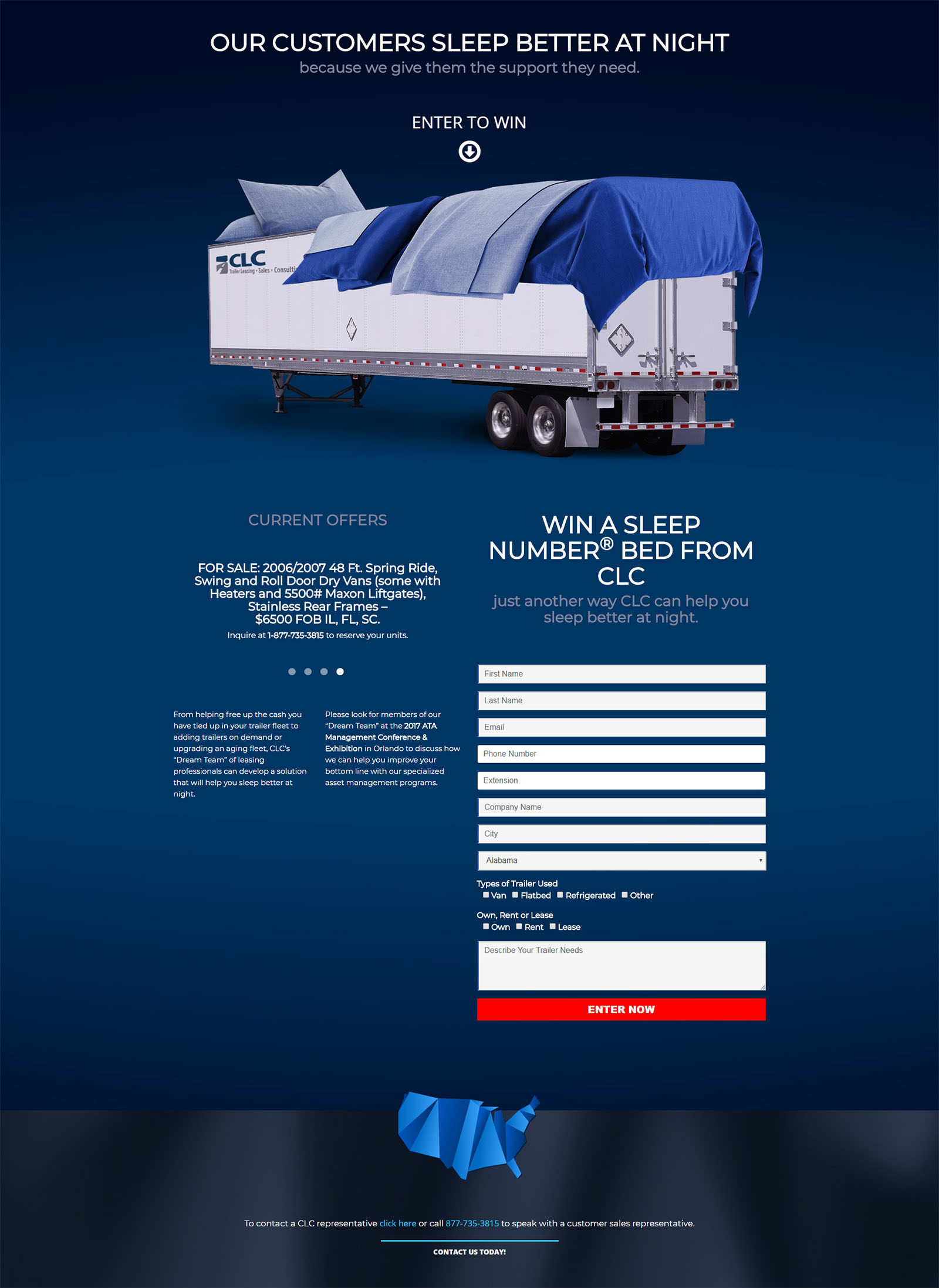
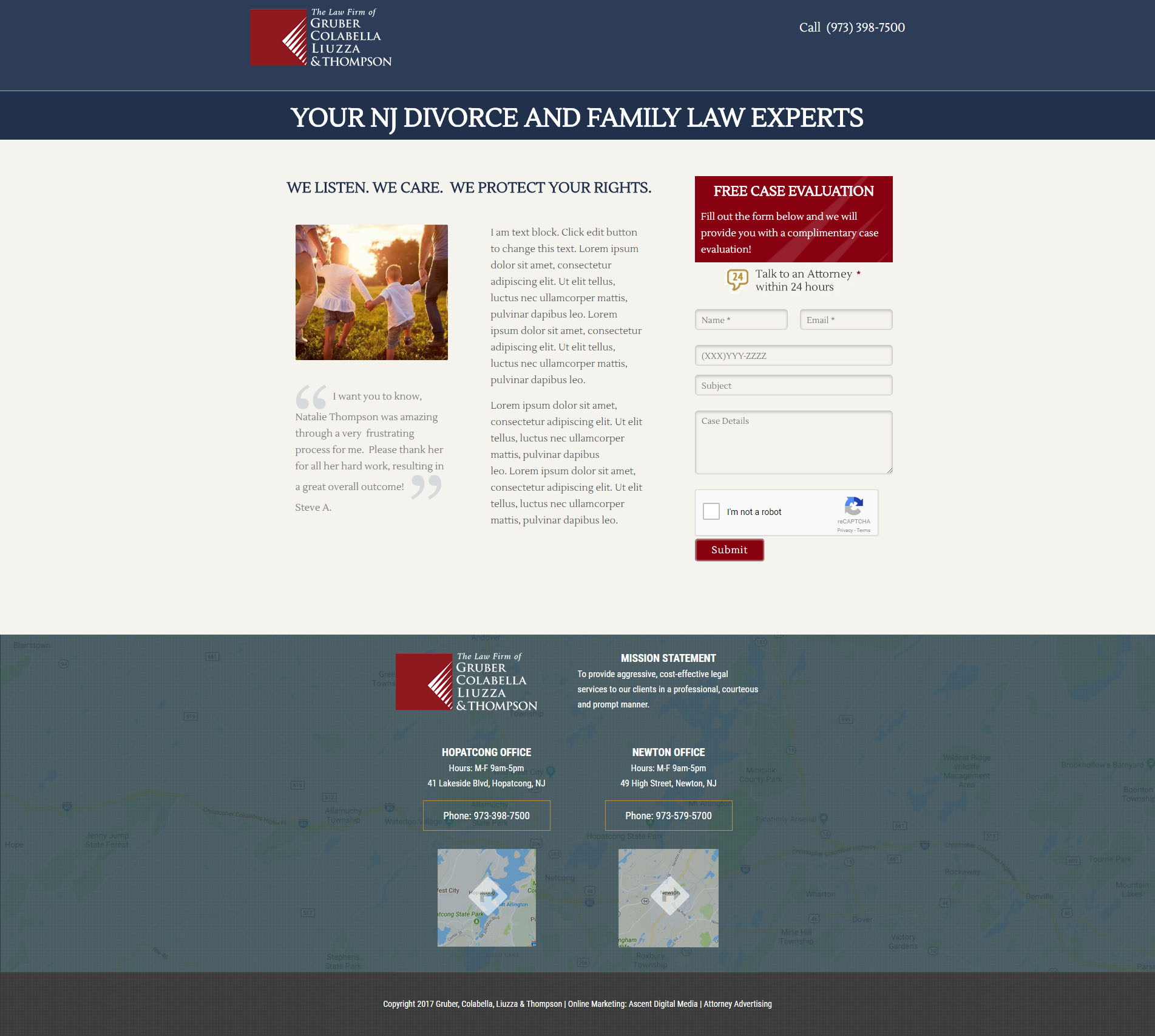
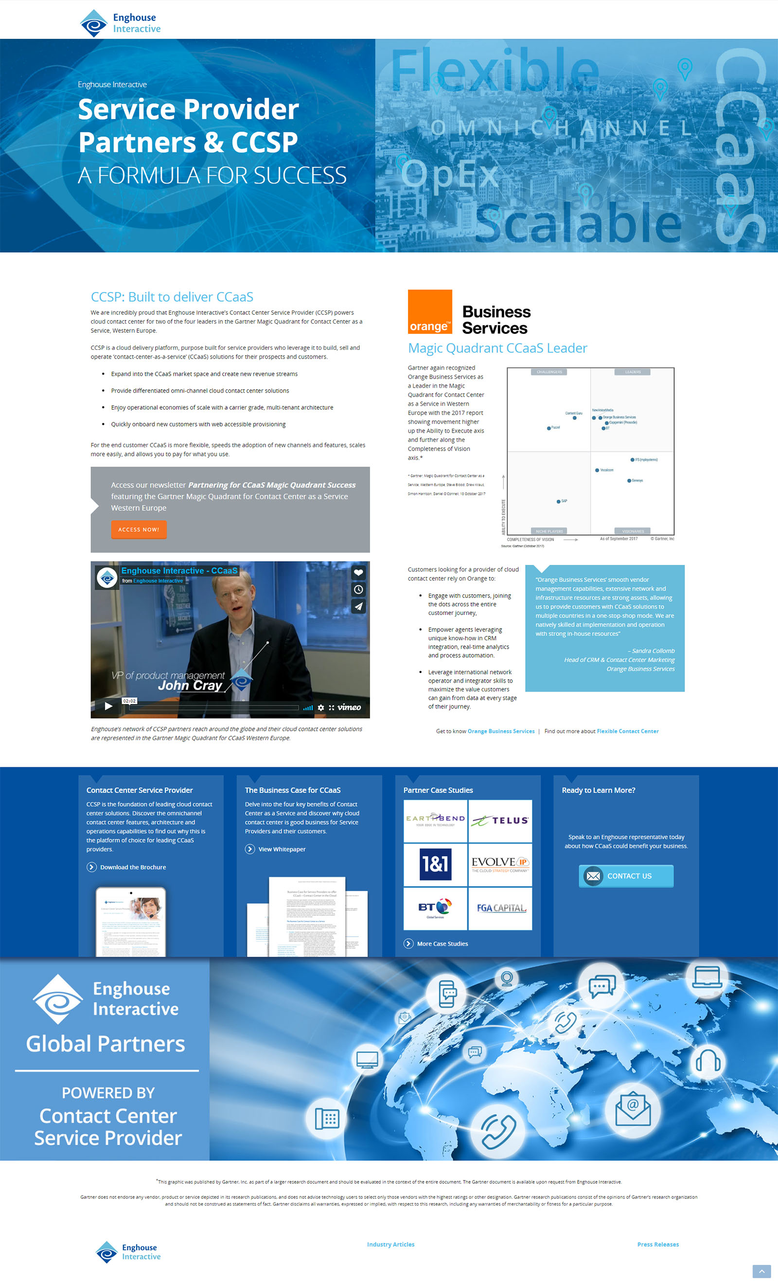
Check out some landing page examples from Ascent’s recent work!
Win a Sleep Number Bed from CLC
Enghouse Interactive: Service Provider Partners & CCSP
CLC: Semi-Trailer Leasing Comparisons
Test It Out!
If you’re just starting out with landing page designs, you may want to create a couple different versions and track how well each performs. This is referred to as A/B testing. Which is converting the most visitors? More specifically, which is converting the most relevant visitors (the ones that you actually want to convert)? If one comes out as the clear winner, send all your visitors to that one.
For example, A/B testing could be done to see which color scheme draws the most conversions: will the target audience respond better to an eye-catching background image or to a cleaner white background?


Need a little help?
The above list of best practices is daunting, we’ll admit. And we didn’t even touch on creating the campaigns, managing them on platforms like Google, Facebook or LinkedIn, or using marketing automation to follow-up with leads and nurture them via email or social media. Running a successful PPC campaign is a big job that requires numerous different skillsets – and it’s rare for any individual to check all the boxes of expertise.
So any best practices for conducting a successful digital marketing campaign should really include this first & foremost: partner with an agency that will share in your goals, provide expert, cost-effective execution, and deliver strong ROI (an agency like us)!
Ascent is fully equipped to handle all aspects of the landing page process, from a professional design to professional content. We also offer SEO and marketing services that will help people not only find your landing pages, but stay connected with your business afterward through email marketing.
Connect. Convert. Cultivate. It’s the goal of your landing page. It’s the goal of Ascent.
So get in touch, and we’ll get to work on your behalf.


